Understanding Color
Color combining in menswear can seem overwhelming. In all honesty, the crossroads of science, art, and philosophy that affect color theory is daunting, and ultimately there is no right or wrong color combination. Fashion is simply a form of visual self-expression - but there are plenty of people who like to voice their opinions of good and bad color choices in relation to dominant cultural associations.
Which colors work well together, what messages certain colors communicate, and how our evolution as mammals played an intriguing role in why we see certain colors are all a fascinating science. Fashion forecasters and trend reporters utilize color theory to tell stories about the social and political climate, and many people choose colors to wear that are subconsciously informed by color theory.


A monochromatic scheme means varying shades and saturations of the same hue. This Adam Kimmel look on the left incorporates several shades in a range of blue hues, and the Loden Dager look on the right does the same with hues in the red range.
 Millions of years ago when the reptiles ruled, the first land-mammals were nocturnal. They did not need to see color because in darkness, other senses like smell and touch, as well as colorless vision, dominated. The reason they were nocturnal is pretty basic - there was less chance of getting snatched up and eaten by the sun-loving reptiles. When the dinos died off, it was safe to start emerging into the light - and primates closely related to humans who were fond of fruit-eating, developed three-cone vision, which enabled humans to see red and other colors, which enabled us to see colorful fruit against a green backdrop. This played a key role in our ancestors survival, and it also fulfilled a crucial role in the survival and expansion of fruit-bearing plants and trees - having mammals carry off and spread the seeds of the plant. The flesh of fruit, like everything in nature, is not simply arbitrary. It is a form of communication, interaction, cooperation, and competition. We see a cherry as red not because it glows red light, but because the human eye perceives a specific frequency or wavelength that is not absorbed by the cherry, and instead, is bounced off and sent to our visual receptors. That color-message is percieved differently by different organisms, and it may seem as though the
  genetic co-evolution of mammals and many fruits is a symbiotic one where we get grub and they get to spread their seeds. Modern humans have almost entirely removed themselves from this amazing, cooperative relationship. Three-cone vision in mammals is exclusive to primates closely related to humans, which suggests that a diet dominated by fruit dense in micronutrients (which results in bright colors) is optimal. Research has shown that trichromats (those perceiving with three-cones) can see around 1 million colors. Dichromats, which make up the majority of other mammals, can only see about 10,000 colors. Interestingly, most insects also have color vision - which is probably related to their diet and role as pollinators.
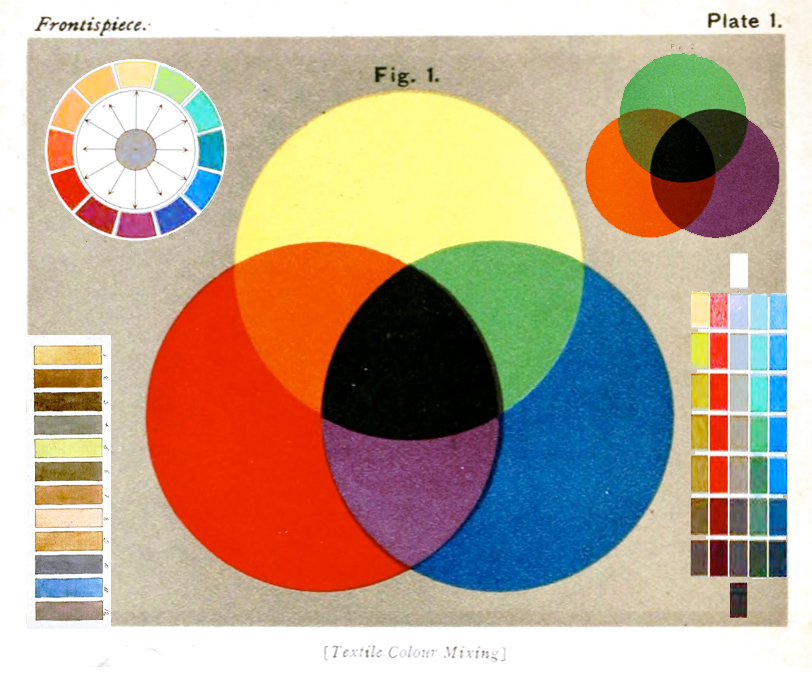
 Back to fashion - complimentary colors exist at opposing sides of the color wheel. On the right, you'll see a diagram that shows red complimenting green from across the way (fruit against foliage), blue complimenting orange, and yellow complimenting violet. Analogous colors exist next to one another. Red, red-orange, and orange. Red, red-violet and violet. In between the primary and secondary colors, are tertiary colors (left). In addition to theories of harmony among color combinations (for which you can have a lesson here), our cultural experiences also inform color combinations. Sports teams, corporate logos, holidays, and flags are examples of a cultural message told through color. There is even a theoretic formula for color harmony:
Color harmony = f(Col 1, 2, 3…n)*(ID+CE+CX+P+T)Wherein color harmony is a function (f) of the interaction between color/s (Col1,2,3...n) and the factors that influence positive aesthetic response to color: individual differences (ID) such as age, gender, personality and affective state; cultural experiences (CE), the prevailing context (CX) which includes setting and ambient lighting; intervening perceptual effects (P) and the effects of time (T) in terms of prevailing social trends.


Complimentary orange and blue paired with neutral gray from Duckie Brown on the left, and a less saturated pairing from Robert Geller of the same principal: green and red - or in this case, olive and pink.
A neutral color is one that contains very low amounts of saturation. Black, white and gray contain absolutely no saturation, and are not actually colors, they are shades. Neutrals go with almost everything, and can still contain subtle suggestions of certain hues. One pair of Khaki pants might look neutral to you until you hold it up against a khaki blazer that does not match, and suddenly, the pants look green.


Tan, white, and gray from Billy Reid on the left, and different shades of black and gray from Paul Smith on the right.
An outfit is typically considered successful by visually analyzing the full look.
"Balance and harmony are achieved by the visual contrast that exists between color combinations. Planning a successful color combination begins with the investigation, and understanding, of color relationships:
- • Monochromatic Relationship Colors that are shade or tint variations of the same hue.
- • Analogous Relationship Those colors located adjacent to each other on a color wheel.
- • Complementary Relationship Those colors across from each other on a color wheel.
- • Split-Complementary Relationship One hue plus two others equally spaced from its complement.
- • Double-Complementary Relationship Two complementary color sets; the distance between selected complementary pairs will effect the overall contrast of the final composition.
- • Triad Relationship Three hues equally positioned on a color wheel."
(sourced from worqx.com)
There is never a sure way to guarantee what will or will not work when it comes to your wardrobe, but my suggestion is stick to these basic principles:
- 1. The easiest thing is to maintain an interchangeable wardrobe of mostly neutrals and shades of black and gray. Arguably, denim-indigo has become a neutral.
- 2. When using color, use sparingly. If combing more than one color, choose colors based on one of the relationships described above.
Here's some examples:


On the top left, John Varvatos used mostly low-saturated, neutral-greens with a splash of a dark shade of an equally low-saturated purple scarf. Purple is in a triad relationship to green, and this is done without looking like Barney the Dinosaur. Bespoken on the top right is mostly neutral gray with a subtle, low-saturated, light shade of blue. Bottom left, Duckie Brwn shows analogous greens with neutral stripes. Bottom right, Buckler's analogous red and purple with all neutral khaki and white.


